Available for select projects

I turn complex, data-heavy SaaS workflows into interfaces that feel simple.

Portrait of Josh Sinkinson wearing glasses and a backpack, in a half-tone black-and-white and blue duotone treatment
Role Product Designer & Design Lead
Based in Aliso Viejo, CA
Currently Leading design at Bluumly

It's good to meet you!

I'm Josh Sinkinson, a Product Designer and Design Lead currently based in Aliso Viejo, CA.

Since July 2023, I've been leading design at Bluumly, an AI-powered SaaS attribution platform for Shopify merchants. As the sole designer, I've taken the product from 0 to 1 — architecting the entire UI/UX, establishing our brand identity, and building our marketing presence from the ground up.

I specialize in transforming complex technical requirements into intuitive interfaces. At Bluumly, this meant designing high-stakes workflows for AI-assisted content creation, conversational analytics, and social-attribution dashboards that make data-heavy processes feel effortless for users.

Beyond pushing pixels, I've built a comprehensive design system in Figma on shadcn/ui foundations that ensures 100% visual consistency across our platform, shipped a high-performance marketing site in Framer, and expanded into strategic leadership — facilitating cross-functional sprints and influencing product roadmap decisions to support early-stage growth.

Two problems, two systems, one product.

Case Study 01

Signup Flow

Reducing friction in Bluumly's onboarding to fix a broken first impression.

Onboarding 0 → 1 Shopify OAuth
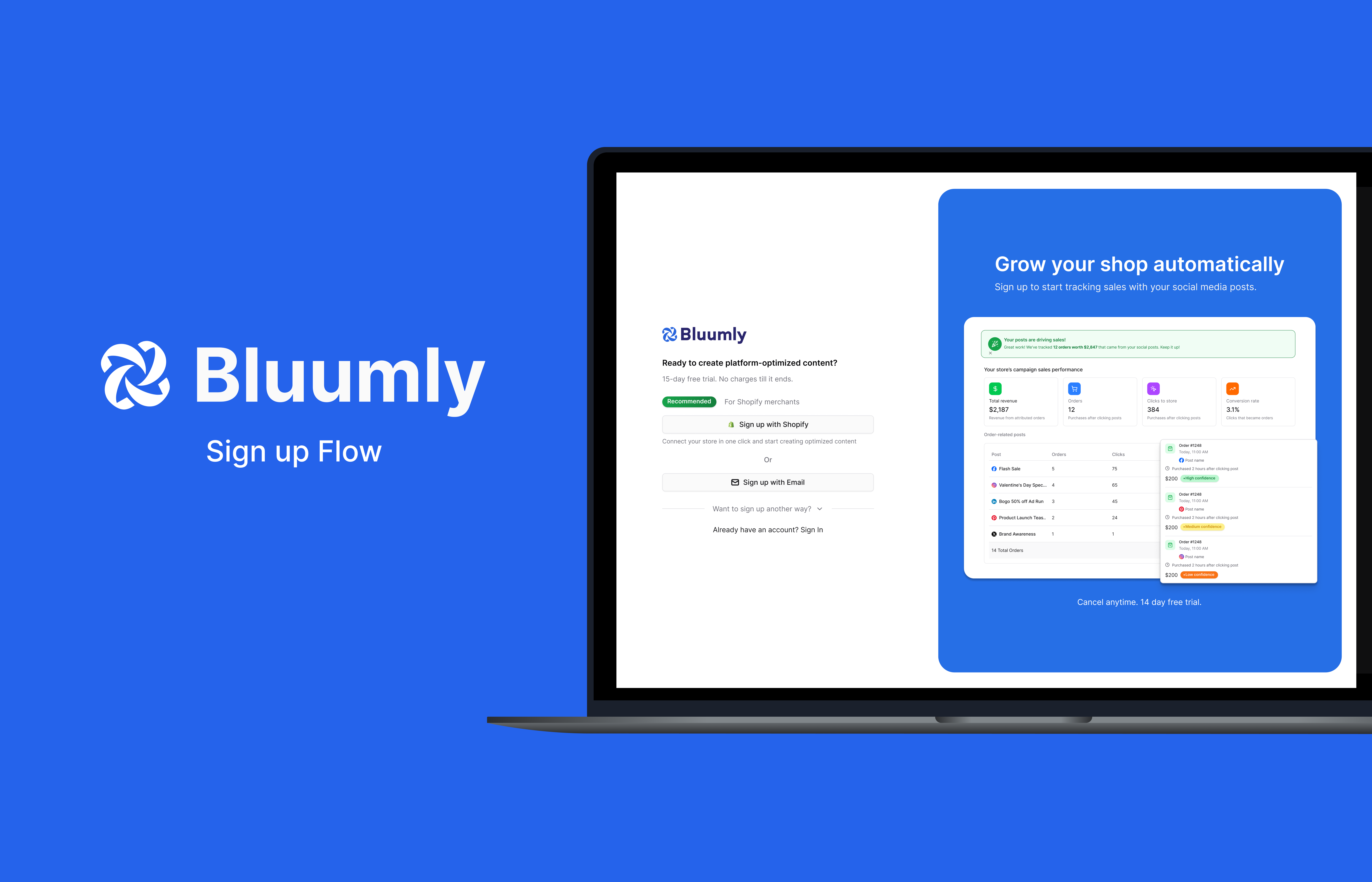
Bluumly sign up flow shown on a laptop, with the sign-up screen and a dashboard panel reading 'Grow your shop automatically'

Overview

Bluumly was facing an issue that many startups face: user acquisition and retention were at an all-time low. I met with the team to discuss what we were noticing in user screen recordings and how we could remedy any user pain points.

The Challenge

When looking into Clarity, it was clear that our users were struggling to get a foot in the door. The sign-up flow initially included a demo flow that gave users a quick overview of what Bluumly could offer before prompting them to sign up. This was a pain point that gave users a false sense of accomplishment and a "gotcha" moment, negatively impacting the user experience.

The original six-step Bluumly signup flow: account creation, demo experience, password creation, connect your store, connect your social media, and end of signup

The Solution

I brought the flow to a fellow designer for a fresh set of eyes. His feedback was specific: the Shopify signup process was carrying too many steps — account creation, a demo flow, password creation, a store connection screen, and a social media connection screen, all in sequence. He recommended reducing the social platform options from seven shown at once down to three, with the rest tucked under a dropdown, and cutting the visible signup options down to two: Shopify OAuth and email.

I took that feedback and focused on three goals: reduce steps, move account creation to the start, and strip the nav bar until onboarding was complete.

The biggest win was adding Shopify OAuth — letting users sign up and connect their store in a single click. For social media, I worked with our marketing strategist to narrow the options down to Facebook, Instagram, and Pinterest based on user behaviour, cutting visual clutter and decision fatigue.

AI-Assisted Workflow

Following my session with an outside designer, I brought his feedback directly into a working prototype using Figma Make. Rather than rebuilding the flow from scratch, I used AI to generate a refined iteration of the existing user flow — capturing the structural improvements quickly. From there, I took the core layout and idea as a foundation, then layered in Bluumly's branding guidelines and built out fully editable frames ready for handoff to our front-end developer.

Comparison of the old and new 'Connect your social channels' screens in the Bluumly onboarding flow

Outcome

  • 6 → 3Cut the signup flow from 6 steps to 3, removing the demo redirect, separate password creation, and manual store connection screen
  • 01Replaced manual store connection with one-click Shopify OAuth — matching how our actual users, Shopify store owners, already expect to sign in
  • 7 → 3Narrowed visible social platform options from 7 to 3, moving the rest under a dropdown to reduce decision fatigue
  • 03Stripped the nav bar until onboarding was complete, removing exit points before account creation

Bluumly was still pre-scale at the time of this redesign, so this wasn't about lifting a metric against existing volume — the priority was removing friction before growth, using screen recordings rather than usage data to guide the decisions above.

Case Study 02

Attribution Dashboard

Bridging the gap between creative output and revenue for Shopify merchants.

Data visualization 0 → 1 Confidence scoring
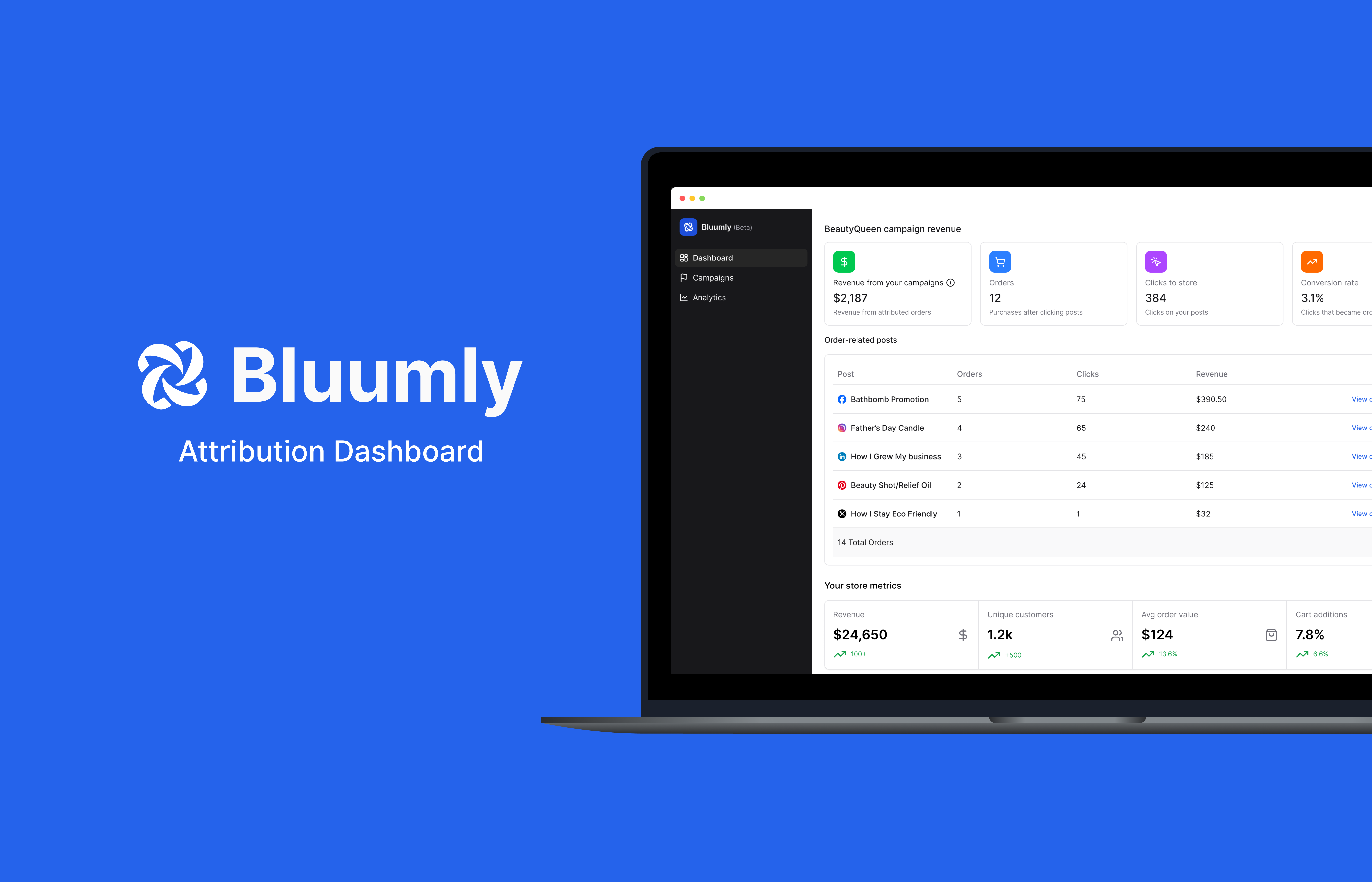
Laptop mockup reading 'Bluumly Attribution Dashboard' next to a screenshot of the dashboard showing campaign revenue and order-related posts

The Mission

Bluumly began as a tool to unify social media marketing, but a solid foundation wasn't enough. We noticed a recurring challenge for our users: social media success wasn't translating into business success. We set out to solve this by asking: how can we bridge the gap between creative output and revenue? This question became the catalyst for our innovation, transforming Bluumly from a scheduler into a growth-focused ecosystem.

The Problem

"Creating content is easier said than done, and for small shops, the value just wasn't there yet."

While Bluumly succeeded in making content creation easy, our users were left with a critical question: how is this contributing to my bottom line? We realized that ease of use wasn't enough to sustain a subscription; we needed to provide proof of value. The attribution framework was conceptualized as a direct response to this user pain point, providing the transparency needed to link creative efforts to revenue.

Low-fidelity wireframe of the order attribution view with design annotations Low-fidelity wireframe comparing single and dual-column campaign layouts with design annotations

AI-Assisted Workflow

After iterating on the lo-fi designs, I fed the wireframes directly into Figma Make's AI to accelerate the transition to high fidelity. This saved significant time in determining layout and visual hierarchy — areas that often slow the early stages of high-fidelity work. Once I was satisfied with the AI-generated output, I imported it into the main Figma file and refined each screen to align with Bluumly's branding and design guidelines, ensuring the final designs felt native to the product.

Diagram of the full attribution user flow, from social post click to Shopify order tracking

Defining the Attribution Framework

Building a bridge between social content and commerce required more than just UI — it required a robust logic layer. I worked closely with our data scientist to define a Confidence Scoring System that could accurately attribute revenue to creative assets. We developed a multi-factor algorithm that analyzed clicks, orders, and conversion rates to assign a specific score to each post. By calculating the time-to-purchase window, we were able to filter out noise and provide small business owners with a clear, honest view of their marketing impact.

I then transitioned this into a high-fidelity interface focused on three areas: an at-a-glance dashboard displaying attributed orders and revenue metrics; a view-switching system for both post-level and campaign-level analysis; and a weighted UI hierarchy that highlights Confidence Scores to distinguish direct conversions from assisted sales. By utilizing shadcn/ui and reusing established components, I ensured the new attribution screens felt native to the existing Bluumly ecosystem — delivering not just screens, but a functional roadmap that respected our developer's timeline.

Orders analytics view showing posts associated with recent orders Bluumly dashboard sidebar and campaign revenue overview
Close-up of an order attribution card showing clicks, orders, revenue, and confidence levels

Outcome

Bluumly was still early-stage, so this project wasn't about proving lift against existing usage data — it was about making a genuinely hard problem legible. Attribution modeling involves noise, multi-factor scoring, and a time-decay window that's difficult to explain even to other designers.

The real measure of success was whether a small business owner with no data background could look at a Confidence Score and immediately know what to trust — turning a backend algorithm into something a non-technical user could act on with confidence.

InBalance Soul logo, a lotus flower mark inside a sunburst circle, over a blurred green plant background

InBalance Soul

InBalance Soul reached out to give three of their room & body mists — Sacred Harmony, Positive Energy, and Balance & Relax — a modern facelift. As the sole designer on the project, I started with symbol exploration, digging into marks that could carry the brand's core message: balance, energy, and calm, distilled into a single icon per scent.

Three explored symbol marks: a radiating sunburst, a three-leaf lotus, and a layered flower motif, on a sage green background

Symbol exploration — one mark per scent, each tied to its own mood

Final label dielines for Positive Energy, Sacred Harmony, and Balance & Relax, shown in green, purple, and blue colorways with ingredient and directions copy

Final label dielines across the three scent colorways

Brand color palette: Dark Olive, Bismark, Shine, and Antique Fuchsia, with hex, CMYK, and RGB values for each

The final color palette, refined across each scent's colorway

All three InBalance Soul mist bottles — Positive Energy, Sacred Harmony, and Balance & Relax — grouped together on a wood slab with crystals, eucalyptus, palo santo, and lavender

Sacred Harmony, Balance & Relax, and Positive Energy in context

Have a project in mind?

I'm always open to hearing about new opportunities, collaborations, or just talking shop about product design.